library(tidyverse)## ── Attaching packages ─────────────────────────────────────── tidyverse 1.3.0 ──## ✓ ggplot2 3.3.3 ✓ purrr 0.3.4
## ✓ tibble 3.0.5 ✓ dplyr 1.0.3
## ✓ tidyr 1.1.2 ✓ stringr 1.4.0
## ✓ readr 1.4.0 ✓ forcats 0.5.0## ── Conflicts ────────────────────────────────────────── tidyverse_conflicts() ──
## x dplyr::filter() masks stats::filter()
## x dplyr::lag() masks stats::lag()WDI_FDI <- readxl::read_xlsx("~/Documents/courses/ma415/final-project-data/WDI-FDI.xlsx")First, we cleaned the external data set to include the FDI values (our first point of investigation). There are many reasons behind this. Firstly, it would be computationally inefficient to import and filter through the large dataset that we found. Additionally, filtering these values using external BI tools can ease this operation. We first decided that instead of aggregating metrics from individual countries, it would be more efficient to make use of the dataset aggregates that have been provided to us. Therfore, we decided to use the following two country groups: “OECD members”: measure for developed countries and “Heavily INdebted Poor Countries”: measure for poorer countries. Therefore, after importing the FDI section of the dataset, we observed that the values for the net FDI were empty. This was a problem- we decided to use the net inflow and outflow measures to create a new column which has the computed net FDI levels. This makes up the first part of the code.
To explore this cleaned dataset, we decided to create some visualizations. Here are 2 plots which we have built as initial explorations. While these plots are not the most aesthetically pleasing, they do tell a good story. The first is a boxplot that shows the distribution of FDI values across the years. We see that the distributions of values is wider for both developed and developing countries in the period starting from the year 2000 to current year. To explore this further, we made a scatter plot of FDI levels over the time periods provided. What we see is that the FDI values for OECD members are more varied, with some having a net negative FDI measure. Interestingly, a slight increase can be seen through the scatter plot in the FDI values for under developed countries, suggesting more growth ensuing from the late 2000s period.
WDI_FDI <- WDI_FDI %>% filter(`Indicator Name`=="Foreign direct investment, net inflows (BoP, current US$)"|`Indicator Name`=="Foreign direct investment, net outflows (BoP, current US$)") %>% pivot_longer(cols=!`Country Name`&!`Country Code`&!`Indicator Name`&!`Indicator Code`,names_to="year",values_to="FDI Level") %>% pivot_wider(id_cols=c(`Country Name`,year),names_from=`Indicator Name`,values_from=`FDI Level`) %>% mutate(Net_FDI = `Foreign direct investment, net inflows (BoP, current US$)`- `Foreign direct investment, net outflows (BoP, current US$)`)

WDI_FDI %>% ggplot() + geom_boxplot(aes(year,Net_FDI,group=year),na.rm=TRUE) + labs(title="Distribution of FDI over years") 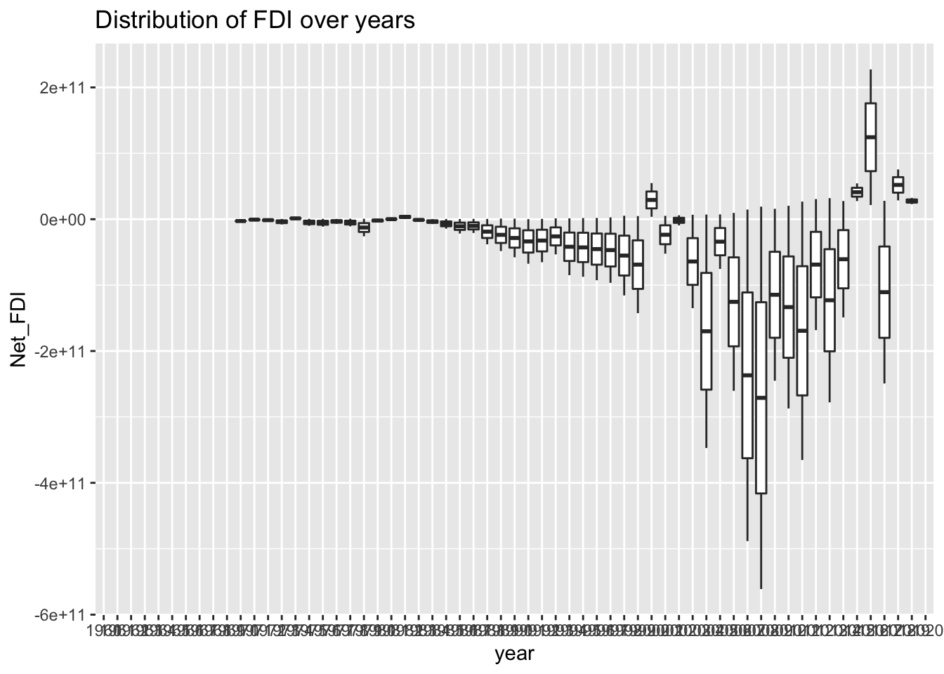
WDI_FDI %>% ggplot(width=1000) + geom_point(aes(year,Net_FDI,col=`Country Name`),na.rm=TRUE) + labs(title="FDI values over the years")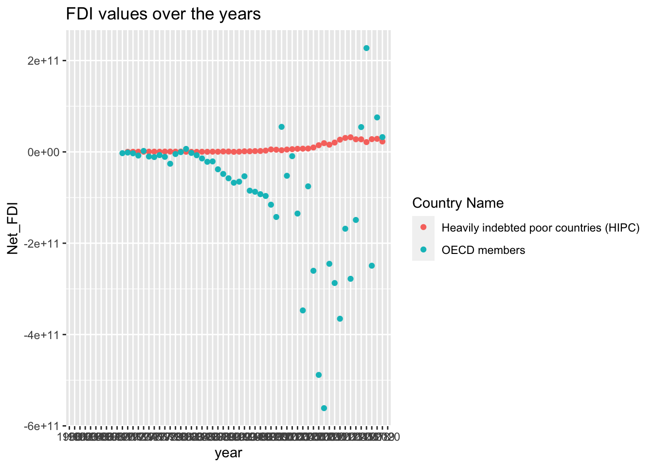
On top of FDI, we determined that GDP growth would be another metric of interest for us to study. Where want to compare OECD member countries and see how they are performing against Heavily indebted poor countries. Seeing which group of countries experienced more growth over the past decades and maybe see which group is primed to experience more growth in the future.
library(ggplot2)
library(dplyr)

data.in <- read.csv('~/Documents/courses/ma415/final-project-data/GDP_Constant_2010.csv')
head(data.in)
## GDP_Constant_HIPC Year GDP_Constant_OECD GDP_growth_OECD GDP_growth_HIPC
## 1 1.06e+11 1960 9.10e+12 4.674889 NA
## 2 1.06e+11 1961 9.52e+12 5.842464 NA
## 3 1.14e+11 1962 1.01e+13 5.522096 NA
## 4 1.17e+11 1963 1.06e+13 6.627528 NA
## 5 1.21e+11 1964 1.13e+13 5.476426 NA
## 6 1.26e+11 1965 1.20e+13 6.100535 NAGDP_Constant_HIPC <- as.numeric(as.character(data.in$GDP_Constant_HIPC))
GDP_Constant_OECD <- as.numeric(as.character(data.in$GDP_Constant_OECD))
p <- ggplot()+
geom_line(data = data.in, aes(x=Year, y=GDP_Constant_HIPC), color = 'blue')+
geom_line(data = data.in, aes(x=Year, y=GDP_Constant_OECD),color = 'red')+
xlab("Year")+
ylab("GDP in $2010")+
ggtitle("Comparing GDP Growth between OECD and HIPC Countries")
p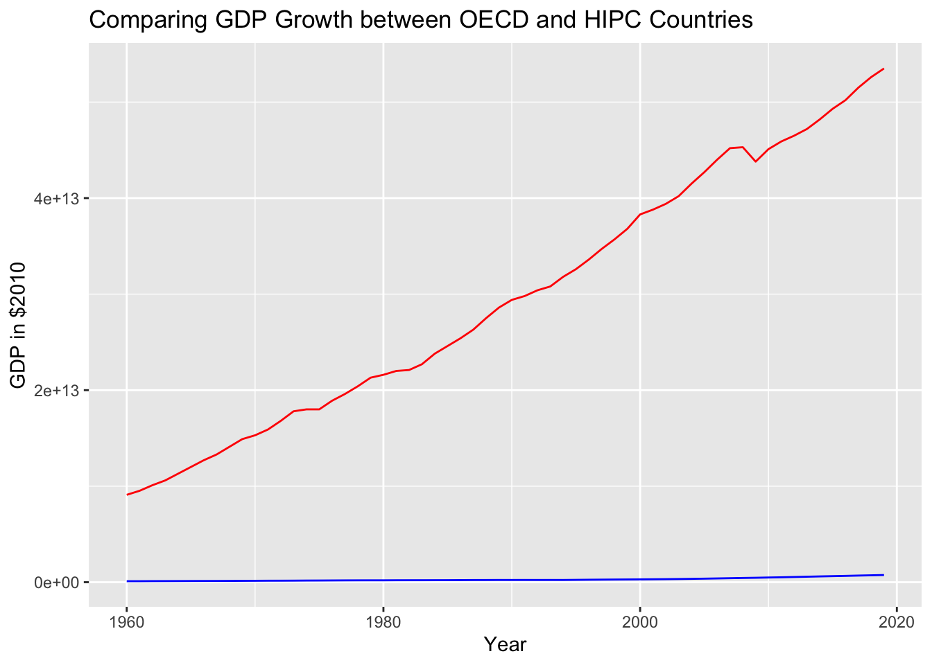 After analyzing this we can see the disparity between the GDP of OECD countries and HIPC is great however the question now becomes whether HIPC countries are experiencing faster rates of growth compared to OECD countries.
data.in <- read.csv('~/Documents/courses/ma415/final-project-data/GDP_Constant_2010.csv')
head(data.in)
## GDP_Constant_HIPC Year GDP_Constant_OECD GDP_growth_OECD GDP_growth_HIPC
## 1 1.06e+11 1960 9.10e+12 4.674889 NA
## 2 1.06e+11 1961 9.52e+12 5.842464 NA
## 3 1.14e+11 1962 1.01e+13 5.522096 NA
## 4 1.17e+11 1963 1.06e+13 6.627528 NA
## 5 1.21e+11 1964 1.13e+13 5.476426 NA
## 6 1.26e+11 1965 1.20e+13 6.100535 NAGDP_growth_HIPC <- as.numeric(as.character(data.in$GDP_growth_HIPC))
GDP_growth_OECD <- as.numeric(as.character(data.in$GDP_growth_OECD))
p <- ggplot()+
geom_line(data = data.in, aes(x=Year, y=GDP_growth_HIPC), color = 'blue')+
geom_line(data = data.in, aes(x=Year, y=GDP_growth_OECD), color = 'red')+
xlab("Year") +
ylab("% GDP Growth")+
ggtitle("Comparing % of GDP Growth between OECD and HIPC Countries")
p## Warning: Removed 35 row(s) containing missing values (geom_path).## Warning: Removed 1 row(s) containing missing values (geom_path).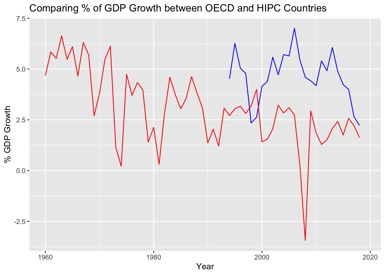
As shown by the chart above, OECD members and HIPC countries have experienced different rates of growth in the past however, within the previous last five years, it seems as though OECD members are experiencing a decline in their growth rate, which could very possibly place HIPC countries above them in terms of % GDP growth.